Posts in "color"
Artwork Inspired by Good Design
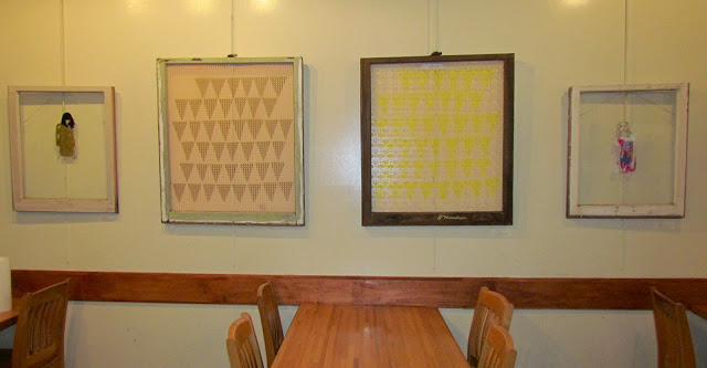
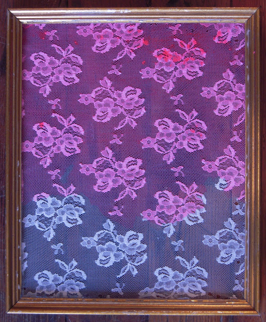
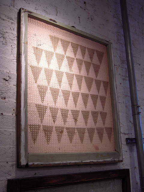
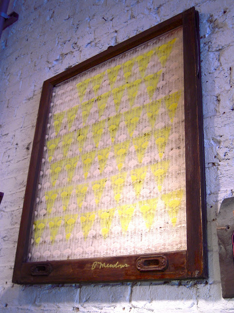
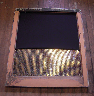
Spray paint on bedspread in window sash 30 x 27.75"
My work is finally completely hung at The Tomato Head on Market Square in Knoxville. Please plan to eat there this month so you will see it. It will also be at the Bearden location in January.

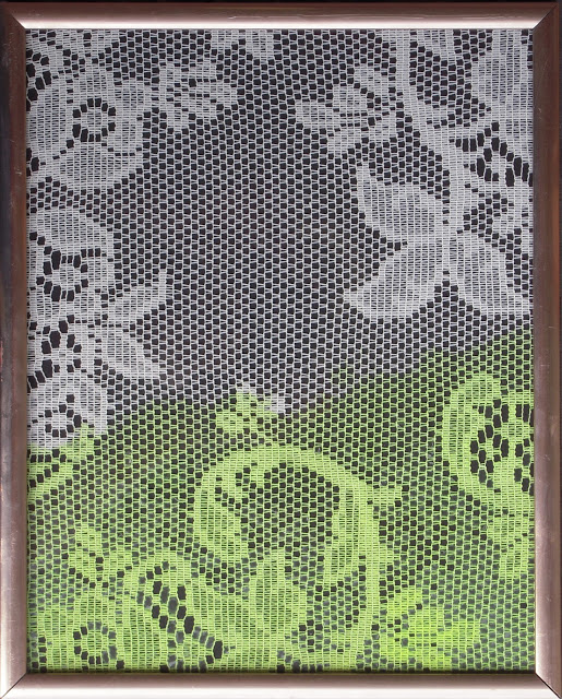
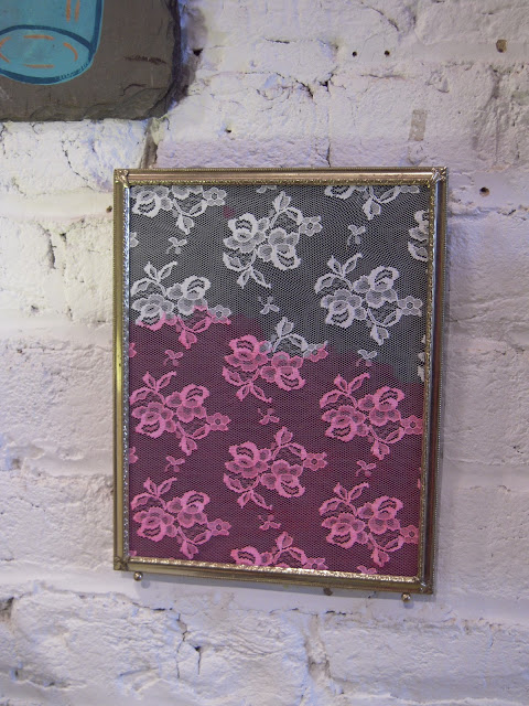
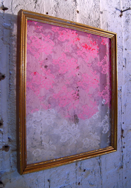
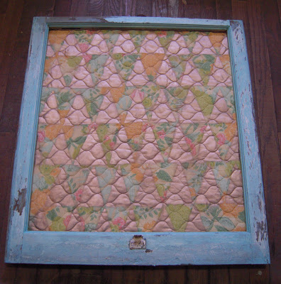
fabric on window sash 30.25 x 27.75"

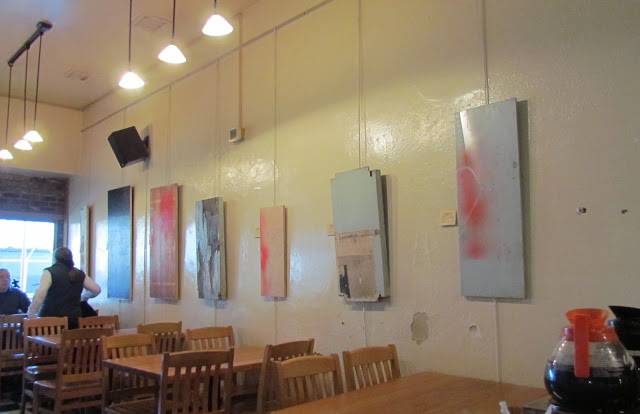
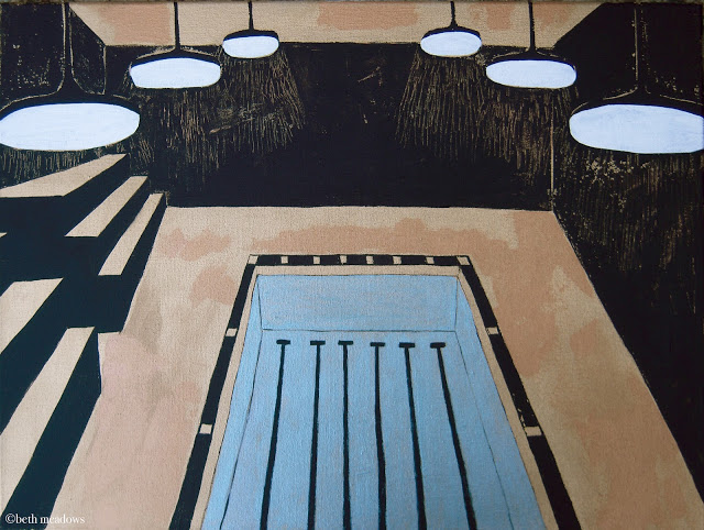
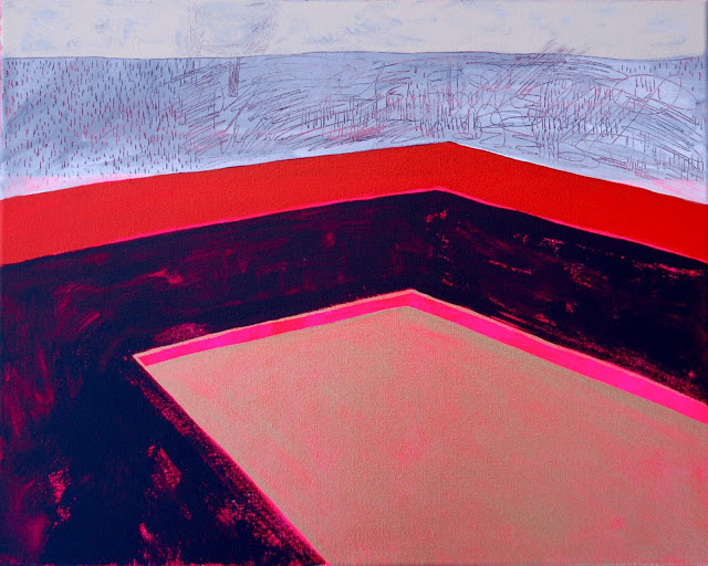
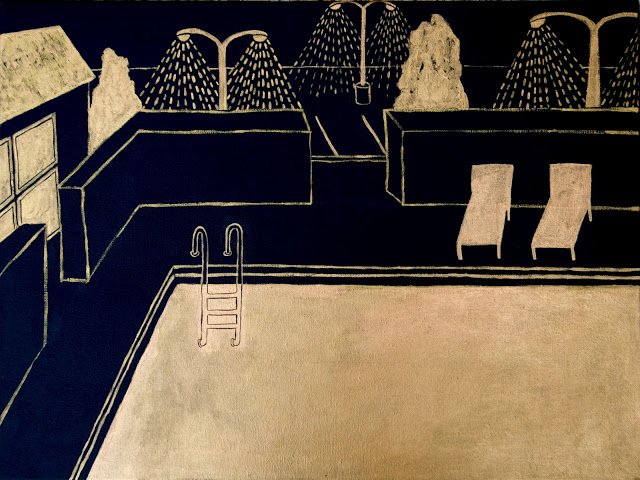
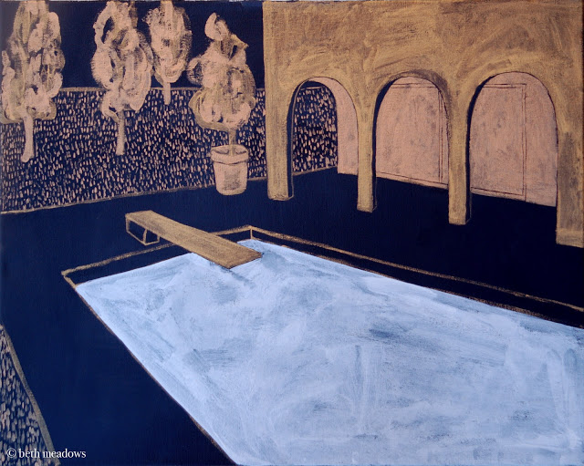
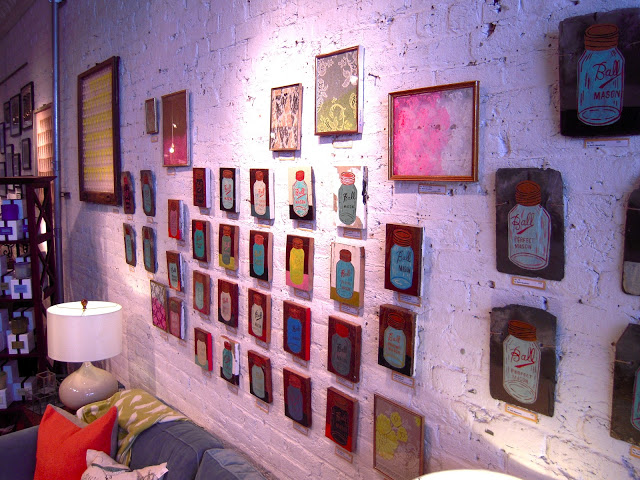
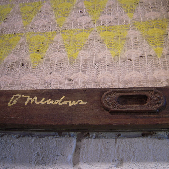
I really enjoyed making the work for this show. You will get more of a grasp on why I made it if you read my artist statement below, but I wanted to mention that this work is very new and different for me. I had painted the pool paintings a while ago, but the most recent work in the show is drawings on window sashes and fabric collages.

I'm moving away from the narrative paintings I've been making for so long. I started some this year, but they have became difficult to finish. I'd like to work on them over time, adding to them every week or so, but now, I'm focusing in on using other materials (fabric, etc.) and drawing on glass.

Drawing is so much more immediate for me. A pen feels closer to my hand than a paintbrush does. I've loved painting, but there has always been an element of difficulty with it for me, an unease. Drawing is more like breathing.

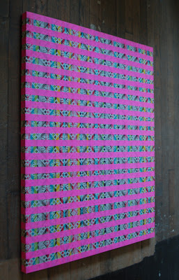
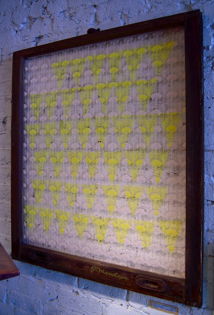
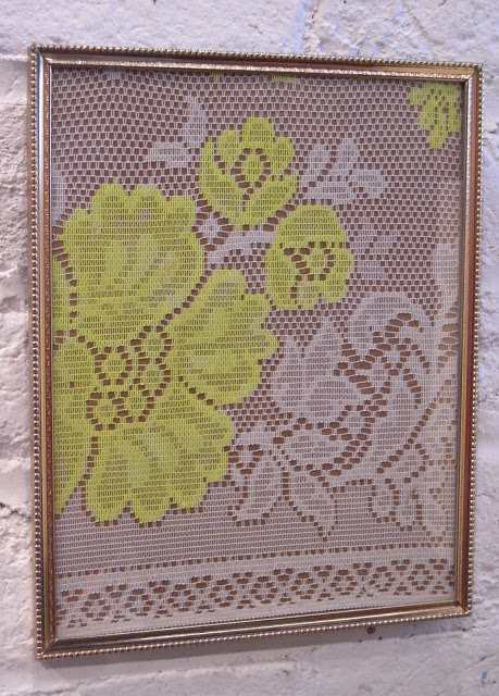
fabric and flagging tape 38 x 30"

Below is my artist statement for the show. I typically labor over writing these things, but I wrote this one quickly because that is how I've been making my work lately- avoiding lulls, trusting instinct. It's a little cheesy, which is good because it means I'm writing about something I love.

A couple of summers ago, my sister bought me a subscription to Vogue. On most days, my mailbox is typically pretty boring, so when I open it up once a month to find that magazine in its plastic packaging, it’s like a mini Christmas.

My first run through the pages is quick, as I ooo and ahh over what I love and furrow my brow at what I don’t. The second time through, I dog ear pages- things I wish I owned, images that are alluring, figures I want to draw, color schemes I want to use. The third time through, if there is a third time, I read articles.

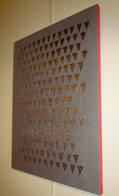
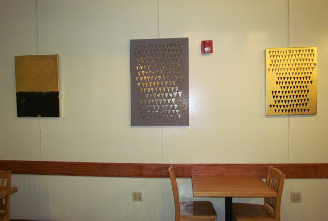
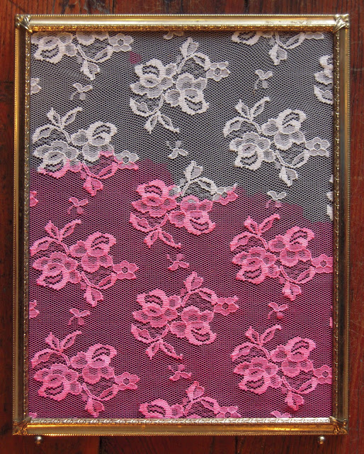
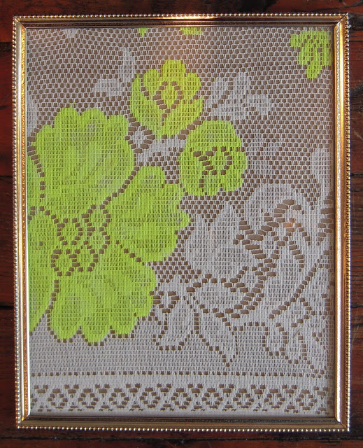
These pieces are influenced by what I am looking at in this and other magazines- gold and black combinations, envy-inducing models in perfectly tailored garments, fluorescent colors, patterns. They are also inspired by my growing network on Etsy, the online marketplace I sell my artwork. Etsy is a place where one can not only see trends in the creative, fashion, and design world but also learn what people are actually liking and buying.

I am intrigued by why people like what they do, why certain things become trendy, and what makes something classic. I’m in awe of impeccable and good design and what people are willing to pay for it. As I observe these things, I want to participate as well. Right now, I am making these pieces to be a tiny part of this large creative industry, to filter all that I am seeing through my brain and hands to make something new and inspired.
New work at The Tomato Head

Next week officially begins my art show at the Tomato Head in downtown Knoxville. I say officially because they asked me to hang two weeks early due to the opening of their new location out west, so some of my work is there right now along with work by Dean Yasko who graciously agreed to fill a wall since some of my paintings were still in Nashville. Next week, his work will leave, and more of my work will go up.

Dean is currently studying sculpture but dabbles in two-dimensional work as well. He is the type of artist that I admire but am not naturally, revolving his work around found-objects, allowing the process of making art to be visible, and finding that process to be as valuable as the final product.

If you have the chance, please go there over the next few days to see these pieces. Then, when he becomes famous, you can say you saw his early work in real-life.


The pieces I'm showing are from three different series that all fall under an intrigue with modern female fashion, not only the garments but the industry as well.

One of these series is the paintings of swimming pools I made a couple of months ago that you may read more about here.


The second series features pieces made using stretched fabric. I've painted on some and others I've cut patterns into and layered up. 


The third are drawings of magazine photographs on old windows. I used paint pens and sharpies to draw on both sides of the window, creating layers. These were a lot of fun to make. 


As I mentioned before, some of this work is there now, and more will be added within the next week. It will be at the downtown Tomato Head December 5 - January 5 and at the new location out west January 6 - February 3. Hope you can stop in.

 I will post some more photos of this work once they're available.

Swimming Pool Series: Pool IV
Beth Meadows Pool IV acrylic on canvas 16x20" 2012
I feel like this painting was an accident, but that may not be accurate. 

I guess what I mean is that I didn't have a vision of this at all when I began painting it. I'm happy with the outcome because it's rare that I wander far from representational work. This painting goes in a direction I've been fantasizing about going in (toward abstraction), but it's going to have to be an accident if it's going to happen at all. I don't think I could do this on purpose and it be successful, at least right now. 


Swimming Pool Series: Pool III
Beth Meadows Pool III acrylic and varnish on canvas 18x24" 2012
I've written before about my love of swimming. Almost a year ago now, I was reunited with swimming consistently in a pool when I joined the YWCA in downtown Knoxville.

Something I haven't mentioned about these paintings is that I'm not looking at anything when I'm making them, which is not typical of most of my paintings. I usually look at photos, but these are based on memory. As I made Pool III, I thought about the pool I know best right now- the one at the YWCA.

At first, the canvas was mostly gold. When I added black on the left side, I really liked it, so after a week or so, I added more all over and scratched into it under the lights, letting the gold come back through.

My painting professor in art school, Michael Brakke, always said that the removal of paint from a canvas is just as important as the addition of it. Everytime I scrape, scratch, or wipe away paint from a canvas, I think of him.

Painting a series gives you boundaries in the art-making process, a thing I'm not used. I typically paint on all types of materials and everything's a different size. While it's been nice to be confined to certain rules I've set up for these paintings, those boundaries also became somewhat irritating. Sticking with it, however, pushed me in certain directions I may not have gone in and it became a challenge I appreciated.

Looking at this series as a whole, I'm happy with the outcome of this painting.

Sidenote: Do you recognize the light fixtures? Here's a hint.


Swimming Pool Series: Pool I

This is the first painting I made for this series of black and gold paintings of pools.

Beth Meadows Pool I acrylic and varnish on canvas 18x24" 2012

I have this memory from childhood of walking out to a parking lot with my family and family friends at night after swimming at a public pool. My hair is wet, I have a towel wrapped around me, and my chlorine infused eyes blur the parking lot lights. 

The memory itself doesn't seem significant. There's also a chance it never even happened. I could have dreamed it or concocted it from reading books or watching TV.

Either way, it is now a painting.

Swimming Pool Series: Pool II

I've painted and drawn swimming pools for a few years now but have recently started a new series mixing this subject matter with a gold and black color palette.

Gold and black is one of my favorite color schemes currently, conjuring up thoughts of high end fashion and design, fame and fortune. There is an inherent glamor when the two pair up, a feeling of luxurious living that swimming in a crisp clean pool makes me feel (no matter how much money I might currently have).

Below is one of about six or seven that I'm in the process of making for an upcoming show I have in Nashville. More to come...

Beth Meadows Pool II acrylic and varnish on canvas 16x20" 2012


Photos of September Show at Bliss Home (Now Showing)
For my September show at Bliss Home, there are still mason jar paintings on wood, but I've added new ones on slate roof tiles. The ones on slate are only $35 (a steal) so go to Bliss Home and get one... or three. If you are afar, you may also order them from my Etsy shop - more will be added this week, so keep your eyes peeled.


I made ten new pieces for this show inspired by an interest in the convergence of trends and classics in women's fashion today.

The image below has directly influenced these pieces- a Valentino ad I saw in Vogue a few months ago.

The vintage-looking lace dresses with hot pink and neon yellow embellishments. Be still my heart. 

Take a look at the beginning of the series inspired by this idea.


Using acrylic and spray paint, I dipped, painted, and spray painted stencils on lace and fabric and put them in antique window sashes and vintage frames.


I limited the paint color scheme to hot pink, neon yellow, gold, and even some black, which is not shown here.


I finished them off by signing the sides and even the fronts of some, in designer-esque fashion.


I'm excited to see where this series goes. I have to take a little break from this work but all ready have ideas for when I can pick it up in a month or so. Can't wait.

If you like what you see, it is available for purchase at Bliss Home this month.