Posts in "Vogue"
Google Search Rabbit Trail Adventures and More
Happy belated New Year! 

Many unforeseen events (aka life) happened at the end of 2012, and so writing here was put on the backburner more times than I liked. With the new year and some new opportunities on the horizon, I hope to stroll through the blogosphere more often. I know you're glad. I am.

I've made a few pieces so far this year, and I'm sharing some of them today.

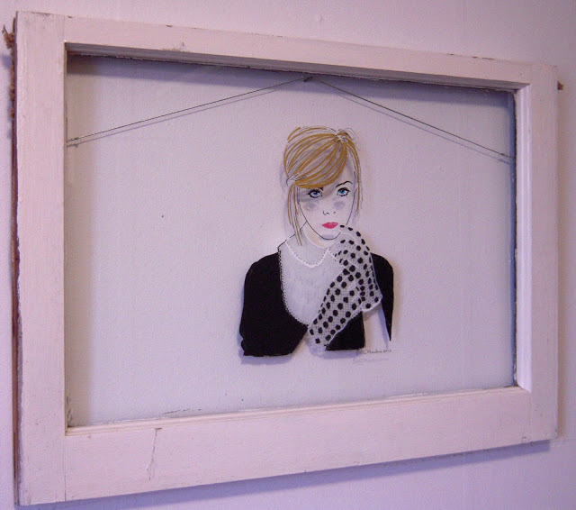
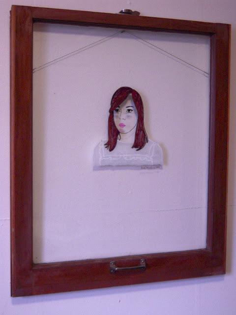
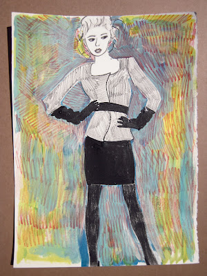
Aubrey
paint pen and sharpie on window sash
$235
I'm continuing to work on the window drawings which has been really enjoyable.
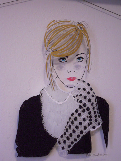
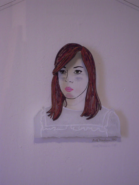
Aubrey (detail)
For me, first finding each image is the most fun aspect of these pieces.

I find most of the images in magazines, but Google Search takes this process to a completely different level of wonder and delight. For example, for Aubrey I searched "Aubrey Plaza fashion ads" (because over Christmas "break" I watched what feels like 100 episodes of Parks and Rec) which led me to Miu Miu's short film It's Getting Late, which led me to Spotify to listen to Zola Jesus, which pointed me to Polica, which just so happens to be a sound I've been in search of for some time.

Oh, the magic World of the Wide Web.
 
***


Elle
paint pen and sharpie on window sash
$235
Last year, I watched The September Issue, a documentary about Vogue, where Anna Wintour discusses the phenomenal impact photographing celebrities instead of models has had on the fashion industry.

I've been thinking about this a lot lately because I had never intended to draw celebrities, such as Aubrey Plaza or Elle Fanning (above), but when you're looking at fashion as an inspiration, I suppose it's inevitable. While I'm more interested in the image than the fact that they're famous, I did choose photographs based on if I like the celebrity or not. Something about this feels... I don't know... too easy?
 
I struggle when things come too naturally, wondering if it's worth making if it's too enjoyable. Should work cause some amount of tension if it's challenging in the right way or is making art about finding the least resistance?
 
***
 

Elle (detail)

 
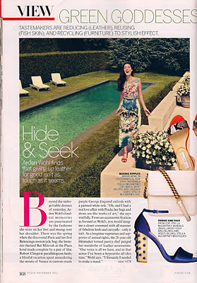
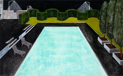
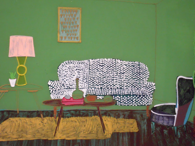
I'm ready to expound on and expand these drawings. Green Room (below) is the start of using the whole window and more "scenic" subject matter. The image is from an Anthropologie catalog. 

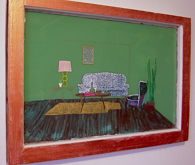
Green Room
paint pen, sharpie, and acrylic on window sash
 
I'm not satisfied with the outcome of this one, but I'll keep toying around with the idea to see if I can improve. I have high hopes.
 
***


Below are images from my show at the Tomato Head in West Knoxville. Some work from the end of last year, the drawings on windows above, and some new fabric pieces are there until Feb 3.

Please go take a look because (my) photographs don't do many of these pieces justice.


New work at The Tomato Head

Next week officially begins my art show at the Tomato Head in downtown Knoxville. I say officially because they asked me to hang two weeks early due to the opening of their new location out west, so some of my work is there right now along with work by Dean Yasko who graciously agreed to fill a wall since some of my paintings were still in Nashville. Next week, his work will leave, and more of my work will go up.

Dean is currently studying sculpture but dabbles in two-dimensional work as well. He is the type of artist that I admire but am not naturally, revolving his work around found-objects, allowing the process of making art to be visible, and finding that process to be as valuable as the final product.

If you have the chance, please go there over the next few days to see these pieces. Then, when he becomes famous, you can say you saw his early work in real-life.


The pieces I'm showing are from three different series that all fall under an intrigue with modern female fashion, not only the garments but the industry as well.

One of these series is the paintings of swimming pools I made a couple of months ago that you may read more about here.


The second series features pieces made using stretched fabric. I've painted on some and others I've cut patterns into and layered up. 


The third are drawings of magazine photographs on old windows. I used paint pens and sharpies to draw on both sides of the window, creating layers. These were a lot of fun to make. 


As I mentioned before, some of this work is there now, and more will be added within the next week. It will be at the downtown Tomato Head December 5 - January 5 and at the new location out west January 6 - February 3. Hope you can stop in.

 I will post some more photos of this work once they're available.

Artistic Calisthenics

I've asked friends to donate their used and unwanted magazines to me. I have a mountain to look through and it feels like Christmas.

I've been collecting images from magazines for a while, and now I'm sifting through them to see if I can make something of them.

Something I want to do more in my studio is quick drawings and paintings to loosen my mind and hand. When I paint on larger canvases, it's easy for me to tighten up and forget the intrinsic energy of painting.

Some of these drawing will be terrible, but that's part of the fun. Hopefully as I share them, it will be entertaining at the very least.

Above is the first stop on this journey, based on a photograph in Vogue. I was drawn to the image initially because, while the woman's outfit is minimalistic, there are lots of sheens and textures to the fabrics. The intermingling of simplicity and complexity, if you will- a juxtaposition for which I have an affinity.

The cream paper is 11x15" and I used black textile paint, colored pencil, charcoal, and acrylic. I'll be using a lot of leftover paint from other paintings for these and inexpensive surfaces I have lying around or find.

If you're reading this and have some magazines or materials you'd like to share, bring them to my studio (or I can pick them up). We can make some drawings together or I can make one for y-o-u.
About the Painting: Pool at Night
This is pretty interesting (to me).

I was perusing this month's Vogue and came across this photo.


What is interesting about it? Well, I made this painting back in 2010.

Pool at Night, acrylic on canvas, 2010, 32" x 52"

The chairs, the shape of the pool, the grass, the hedge, the walls... the similarities surprise me.

***

The painting was based on fond memories of swimming at night in my grandparents' pools. Yes, both sets had one. I may have spent just as much of my childhood immersed in water as I did on dry land. I loved when my sisters, friends, and I could swim at night with the pool light on. Pool-light-at-night is still one of my most favorite colors.

Oddly enough, the painting was also inspired by something far less innocent- the movie The Graduate, specifically the scenes in the Robinson's house, with the green filling the windows. I wanted to convey the glamor of that movie, to show someone rich lived there. Without knowing it at the time, I also conveyed the emptiness and sadness of the story as well.


Also, there was the pool.